
See How the World’s Most Polluted Air Compares With Your City
For the first geo-located NYT AR project, we created an augmented reality data visualization that enables readers to project current pm2.5 pollution levels at their location into their surroundings. AR is used to magically make visible the invisible harmful particles that surround us. Additionally, pollution data from other key locations around the world can be overlayed into the environment, in order to compare local air quality to some of the world’s most impacted cities.
View the interactive here.
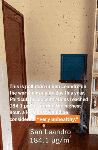
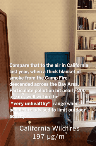
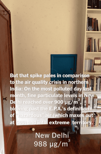
Using a spatial approach, we allow readers to intuitively understand this data, which is measured in terms of parts-per-volume. It’s another example of how spatial approaches in data visualization can enhance understanding.