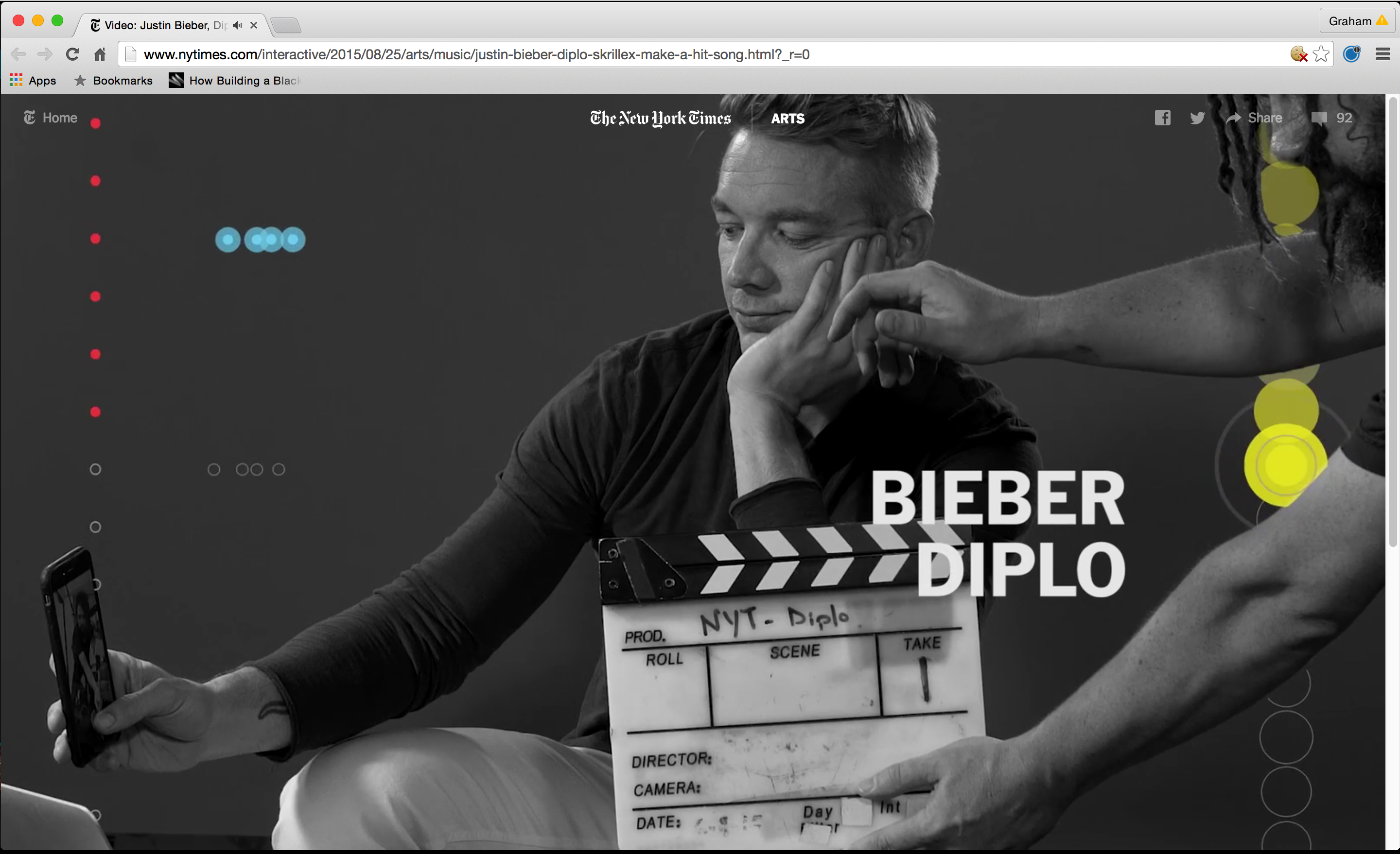
Bieber, Diplo, & Skrillex Make a Hit
A marriage of interview and visualization to pull back the curtain on the making of a summer hit, "Where Are Ü Now," with Justin Bieber, Skrillex, and Diplo, and the evolving process of how music is made today.
Watch on NYT here.
Below, some backstory and process.
Update: This project has won an Edward R. Murrow award, and is nominated for a News and Documentary Emmy Award

The concept for this project started as a somewhat generic idea — a culture project about a summer hit.
But when Times Pop Music Critic Jon Pareles confirmed that we had lined up interviews with three of music’s biggest names — Justin Bieber, Sonny Moore (Skrillex), and Wesley Pentz (Diplo) — it was clear that the potential for an interesting piece with a large audience was high.
Not to mention that the track they all collaborated on, Where Are Ü Now, was already reaching 100 million streams (250 million as of 8.31.2015), and the social network between these three stars topped 100 million followers.
I was looking forward to the chance to produce another music focused project, and try a new approach towards using visuals to explain musical ideas. I was thinking of it as a part three, in a sense, of a series.
The first, Connecting Music and Gesture, was a motion capture experiment to explain conducting with Alan Gilbert. The second, Inside the Quartet, a 3D-point cloud capture experiment with Kronos Quartet. And now, a chance to get inside the minds of producers of pop music.
While agents and handlers were being called, I began to wrap my head around the structure of the song itself.
I created this map of the song as the first thing, which helped discover what all of the pieces were as best as I could hear, as well as the larger sections.
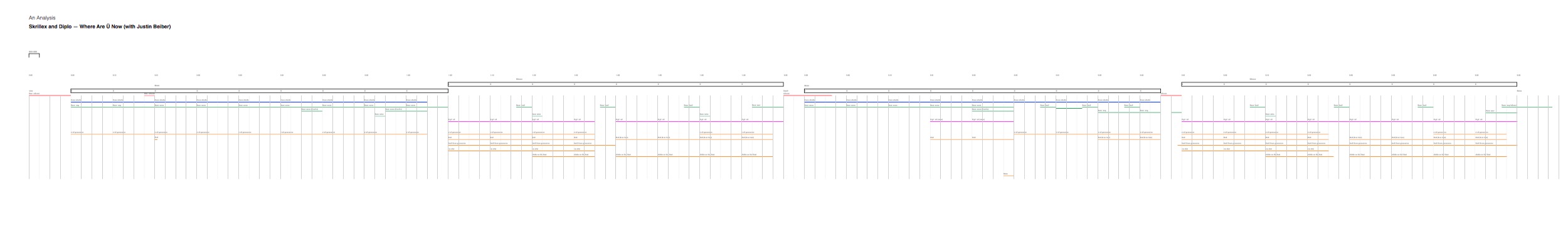
I started creating some small experiments with animated visuals representing each of these parts. (video at left)
At first, I thought maybe we should create looping modules for each song element, as most of the pieces of the song were based on loops in one way or another.
I also began seeking out ‘stems’ or individually separated tracks from the label, Atlantic Records. They were very cautious about this, and ultimately would only give me stems for the piano and the vocals. The label did not agree to us using any of the stems in the piece, but we were lucky that both Diplo and Skrillex played isolated elements from their sessions during the interviews to help us explain each part.
After a number of meetings with Graphics director Steven Duenes, and culture graphics editor Alicia DeSantis, we settled on an experience for the piece that would be full-screen in the browser, and have separated visual streams that would represent each musical element of the track.
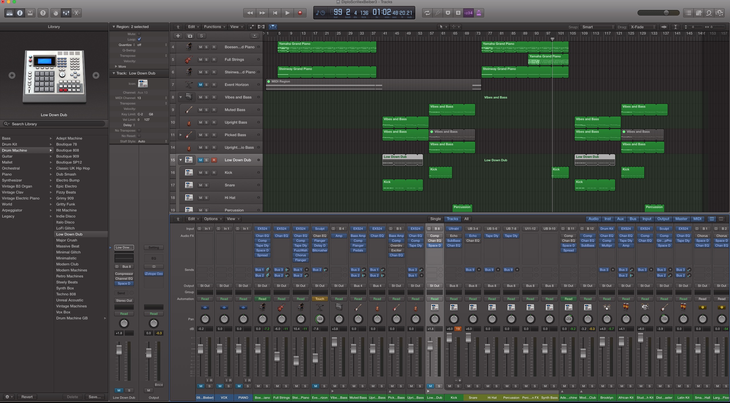
To fully understand all of the patterns in the music, I recreated parts of the track in Logic. Here's a sample of what that sounds like. Pretty terrible, but its purpose was making sure I had all of the parts, and the patterns reproduced properly.
I wanted the graphics to accomplish several things.
• to give an immediate understanding of what was going on in the song through separated colored strands
• to serve as a way to highlight different parts of the tracks as they were discussed in the interviews
• to allow you to see a before and after of the music, visually enhancing understanding of how all of the parts combine
Experiments with this format were conducted even before we shot any interviews. And this was a good thing because combining the visuals with the interview footage was going to be a tricky thing, and this informed how we ultimately designed the shoot.
We used black and white footage so that it would not compete with the graphics, and used a more centered framing that would allow visuals to live on both sides of the figure without too much overlap.
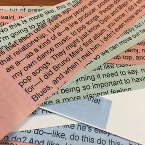
The editing process was a great challenge. Alicia and I poured through hours of material from these interviews, much of it compelling and/or hilarious. We began the editing process with transcripts in spreadsheets, color coding each subject as to have a sense of how much we were using from them. Alicia even printed and cut these out to wrap her head around it.
We needed to create a coherent dialogue between the three even though the interviews were conducted in different places at different times. Once this began to come together in the spreadsheet, video editor Taige Jensen organized the multi-cam footage and helped begin to cut the piece together. This would become an iterative and collaborative editing process that the three of us would spend many hours crafting.
From this point, the work was refining the graphic elements, and being very aggressive with the overall cut to get it down to a goal of under 10 minutes. The final was a relatively tight 8 minutes.
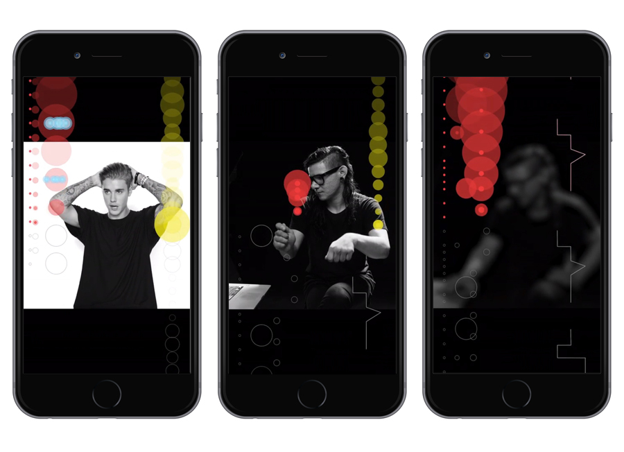
For presentation, we wanted every device and browser size to be ideal for the piece, and this is where graphics editor Wilson Andrews came in and gave the piece its final polish. The browser loads one of three different versions of the video based on initial browser size, possibly a first for a video production like this at the Times. The three sizes were 16:9, which was also used in the Times video player and YouTube, 3:4, which was also served on the iPad, and 9:16, which is the vertical size also served to mobile.
And graphics editor Yuliya Parshina-Kottas did an amazing job, among many other things, rotoscoping the footage so that in the widescreen version the graphics would appear behind the subject.
The mobile presentation is really my favorite, and something I had in mind from the start. The taller the graphics are, the more value they add as you can see further into the future and past of the sounds as they go by.